
Introduction
What are calls to action? And why are they your gate towards digital success?
Online marketing strategist and best selling author David Meerman Scott once said that
“when people come to you online, they are not looking for TV commercials. They are looking for information to help them make a decision.”
Think about that.
Today more than ever, online marketing is a must for every business and startup in the world. And with digital allowing you to reach and connect with thousands of potential clients, it’s fundamental to find the best way to drive them towards the outcome you want the most (purchasing products or services, subscribing to a newsletter, and so on).
Do you feel lost and don’t know how to transform your leads into actual customers? All you need are calls to action (quite literally!).
Keep on reading to learn more about effective CTA strategies for your startup!

WHAT is a call to action (CTA)?
In marketing gergon, a call to action indicates a prompt that encourages a user to perform a specific action along the conversion funnel of a digital platform such as web pages, e-mails, SoMe and so on.
Sounds complicated? It really doesn’t have to be, so let me rephrase it for you.
In a nutshell, call to actions are those “click here” or “buy now” kind of interactive buttons or hyperlinks that persuade your visitors to perform a desired action.
This action makes them proceed through the steps towards buying your product or service.
Therefore, it’s extremely important that your leads do not fall out of track and keep on browsing your website until they become prospects or customers.
Whatever their purpose, CTAs do not only take the form of buttons: they can also be hyperlinks, pop-ups, inlines, forms, and so on.

WHY should you use call to actions?
Let me make an example.
An average man living in an average town named Jim is feeling snacky, and wants to grab a bite to eat. Jim is not sure what to go for just yet, so he hops into his car and starts a quest for something delicious to put under his teeth.
While he drives around, he happens to see a big board advertising the new ice cream place that you have just opened in town, and – great! – he is getting curious about it.
Unfortunately, there are no clear indications on how to reach your shop. Jim is confused as he can’t find his way around, and eventually gets frustrated and desists on the idea of a delicious scoop of ice cream.

This trivial yet effective example emphasizes why you should make use of calls to action.
I am sure that if there were better indications on how to reach your ice cream place (turn left at roundabout! Go straight for about 500 meters!), Jim would be tasting a strawberry cone right now, and you would have achieved your goal of selling your product.
The ultimate goal of implementing calls to action to your web pages is attracting your visitors and convincing them to take a further step towards your goal of making sales.
So, it is extremely important to guide your lead through a targeted consumer journey and to gently – yet firmly – push them towards performing an action and, therefore, move down the sales funnel.

Therefore, the use of calls to action:
- improves user experience quality of your visitors
- makes the consumer journey easier
- increases conversions rates
- contributes to the overall design and look of your webpage
HOW should your call to actions look like?
There are no absolute rules in terms of how a call to action should look like, therefore we strongly suggest that you test out different button texts and formats to see what works best for you.

To do so, we recommend that you create eye appealing landing pages and use one of the many A/B testing platforms. You can follow this landing page checklist to effectively measure the effectiveness of your landing pages, CTAs and your conversion rate.
Nonetheless, there a few strategies that seem to be better performing than others:
Button copy
Unfortunately, not any CTA copy will do the trick.
Nowadays, simple, extremely short and generic copies such as “click here” and “download now” are just not effective.
Users expect to be told why they should comply with the call to action, so startup founders shouldn’t be afraid to tell in a clear and strong manner what they can offer (numbers work great!), and to reduce risk perception by reassuring users on what they will actually get once they click on the CTA.
As a rule of thumb, the more related to your product or service, the better your calls to action will convert.

Users will be more likely to click on your CTA if you show how valuable of a solution you can provide to their problem and if they get to know about the benefits straight away. And the smaller the commitment, the better.
For example, Netflix does a great job with that by offering its audience a free month trial and making sure to inform them that they can cancel at any time.
It might seem trivial, but this is sufficient to reassure perspective consumers that opting out of the service won’t turn out to be a hassle. Low risk, low commitment!

Ever heard of FOMO? It is always a good idea to give out free trials, therefore including triggering words as “free”, or “now” and “today” will convey a sense of urgency and give users a further push towards performing the desired action.
And exit popups you were wondering so much about – YES, they convert.
Countdowns and limited offers are every startup founder’s best friends, so do not be afraid to use them!

It has also been proved that first-person phrasing leads to a higher CTR, therefore a “teach me more” will likely be more effective than a “learn more” call to action.

Color
Colors have a psychological effect on people. Blue seems to be associated with trust, yellow with cheerfulness, purple with creativity.
But founders shouldn’t be taking this as an absolute truth, as every web page should prefer the colors that best serve the purpose of catching visitors’ eyes, and push them to click.

What will make you win in the fight for the users’ attention is the color combination you use and the brightness.
Ideally, you either want to go for colors that pop over your web page, but that do not clash with the overall look and colors of your brand, or stick to your distinctive colors for continuity.
Coming up with the perfect eye-grabbing combo from scratch would definitely be a mammoth task, so let color theory come to help.
Complementary colors and triadic colors are definitely the way to go. Even if at first glance they have nothing to do with each other, these color combinations actually make sense on the base of the color wheel.
You can play with it and find the best color for your CTAs with Canva’s Color Wheel, a powerful online tool that you can use completely for free. Why don’t you give it a try?

Also, remember to stick to the same shade of color for consistency. To do so, make sure that the HTML Color Codes are exactly the same.
Size and shape
There are two main edge shapes for CTAs: rectangular and rounded. And unfortunately, there is no way to determine what will work best for you but testing.
One thing is for sure though: the bigger your CTA, the more noticeable it will be.
This does not mean that your call to action should be as big as the entire screen. Just make sure to make it stand out and give it the right prominence over other, “less important” elements of the web page.

It is also key to let your calls to action have a decent amount of “empty space” around them, to allow the user to really focus on it without getting distracted by other surrounding content and elements.
If you use pictures, it is very effective to make people look at your call to action, as this simple detail will guide the user’s gaze towards the goal.

So let’s summarise it all real quick:
- State reasons, benefits, values
- Be clear
- Appeal to FOMO
- Use 1st person language
- Remove risk
- Use bright, eye-catching colors
- Make your CTAs noticeably big
- Give your CTAs enough room to stand out
- Be consistent with your style choices
- Test your CTAs out to find out the perfect solution for your business
WHERE should you put your call to actions?
While the looks of your calls to action is definitely key, where you place your calls to action and the amount you decide to go for play as critical as a role in leading your audience towards the direction you want them to take.
In fact, after a visitor has landed your web page, they will try to understand what is the next move to take.
And, as it is very likely that users will access your web page starting from different steps of your funnel, it’s necessary to prevent them from clicking away through the use of clear and well placed CTAs.
So, here’s some guidelines on how to achieve so!

Make it visible
Users shouldn’t be looking around for your CTAs: make sure that your calls to action are clearly visible and easy to find.
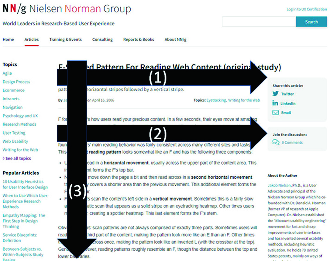
To make certain to do so, it can be useful to rely on the so-called F pattern.

When reading content online, all westerns have a habit of scanning important headlines first, then following a left to right, top to bottom direction.If you think about it, that layout traces an imaginary F letter, therefore the name.
This teaches us that placing a CTA at the beginning of a webpage, when viewers haven’t read about the product or offer yet, is probably not ideal.
The best choice is to place your calls to action at focal points of your page, where users’ eyes are naturally drawn, for a simple matter of habit. Try to believe!

Do not overload
The last thing startups want to do is overloading users with an unnecessary, exaggerated amount of CTAs.
In fact, you should always keep in mind that you want to provide help and support, rather than sounding straight-up salesy. People are more likely to click on your calls to action if they do not feel pressured to do so.
Also, adding too many calls to action would just end up being confusing – less is more when it comes to variety of choice. This way, you will convey a clearer message on what you want the user to do.

Renew your solicit
It might sound contradicting with all we have just said, but don’t be scared to put as many CTAs as you see fit – when it makes sense to do so.
In fact, this tip goes hand in hand with the previous one – it’s a matter of balance.

One needs time to learn about the product by reading the page copy, so let them get interested and know what they’re going to meet, before offering again the chance to hop on and join.
It is very common to have a standing CTA in the top right corner of a web page, but people tend to forget about it fairly soon. So, remind your audience to take action by adding a new CTA – I repeat it – where it sounds logical to add it.
But how to understand when the time is right?
Ever heard of the 6 hats technique? In this case, you will only need two: the startup hat and the user hat.
In this extremely simplified version of the technique, imagine taking the startup founder hat off and wearing the user one. Once you have done so, you assume the role of one of your visitors.
This technique will help you better understand the customer perception and interactivity of your website.
Scrolling through your web page as if you were a new user approaching your website for the first time will allow you to take a completely new look at it.

Looking at familiar things from a different perspective is a very underestimated tool to highlight strengths and flows that would otherwise remain unnoticed.
Another, extremely valid option consists in relying on an engagement heatmap. This powerful tool will unveil where people engage with your web page the most and where they focus, giving you a full picture of the situation. Many can be found online.

In brief:
- Make your CTAs easy to find
- Place your CTAs strategically
- Do not exaggerate with the amount of CTAs
Recap and conclusion
Let’s go back to the ice cream example real quick. You have taken your business online, and your customers can now order your products through your website.
Users have reached your homepage, so how to convince them to buy your delicious product and increase conversions?
Let’s apply what we have learnt so far – I am gonna start.
Instead of a trivial and boring “buy now” button, I would show my potential buyer what kind of value they will get by clicking on my CTA.
If I state that my ice cream is the best in town, a “order now and get a 10% discount today only” or “try a free sample now!” should be enough of a push to convince people to give it a try.
I would also make sure not to clutter up the web page elements and to give my CTAs the right breathing space.
Now it’s your turn – what other CTA strategies would you adopt to increase your ice cream sales?

Of course, my suggestion is just one of the many ways to do that. What works for my startup might not work for yours, and the other way around. So, don’t be scared to give free rein to your creativity and to try out new CTA strategies and techniques for your startup and user base.
One last tip: taking a look at what businesses just like yours do is always useful, as you get to see many different strategies put into practice and get a chance to learn from them and get inspired.
Do not discard potentially successful options for fear of failing: just make sure to run many tests to see what works best for you and achieve amazing results!

BIO/Author

Alice is a young digital marketer and content creator for Klint Marketing.
Her love for languages and the marketing world have led Alice to pursue her dreams of learning and improving her marketing and writing skills in an international and challenging environment.


